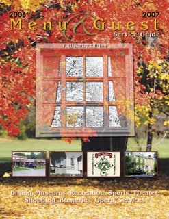
 The original assignment was to design the cover for the Fall Edition of this magazine. It was the left image sans the transparent window. I had to change it to Fall/Winter at the last minute. I was asked to somehow depict a Fall element incorporated with a Winter element. Of course, the first thought is to blend, from right to left, Fall leaves with white snow. But, that was too easy and obvious, I felt. So, since we are in Fall and going into Winter, I decided to place a window with a view of what's to come: A Winter scene. And adding a Maple leaf to the winter side of the glass gave it a sense of whimsy. The 4 squares below the window are advertisers that have interior ads. If it was up to me, I would leave those off.
This is one of my favorite pieces I have developed for my new employers because it is different than most of the stuff I've seen coming out of here and I learned a new process in Adobe Photoshop that I never used before. hope you like it.

No comments:
Post a Comment